Anchor
How I discovered why 50% of budgeting app users quit after day one (and designed around it)
Budgeting apps solved tracking. No one solved interpretation. I designed a four-step mobile flow that turns spending data into confident financial decisions, moving the category from awareness to action.
My role
UX/Product Designer
Course
Capstone in User-Centered Design
Timeline
8 weeks

The situation
People open budgeting apps and leave before they act
When Mint shut down, its users scattered across four competitors: Monarch, YNAB, Rocket Money, Copilot. I looked at what each one does and found them all fighting over the same thing.
They compete on how much of your financial life they can capture—aggregation, investments, subscriptions, credit monitoring. Tracking is basically solved.
But there's a gap underneath. Secondary research from TIAA, Discover, and Bankrate showed the real problem clearly:
of adults 18–34 bank mobile-first. Access isn't the issue.
check their balance weekly. Awareness isn't the issue either.
say they dread budgeting and actively avoid it.
abandon a budgeting app after the first session.

"I opened the app, saw all the red numbers, and just closed it." — Industry research
People can see their spending. They can't interpret it, and the apps showing it to them make them feel worse. So they disengage before they ever make a decision.
The research
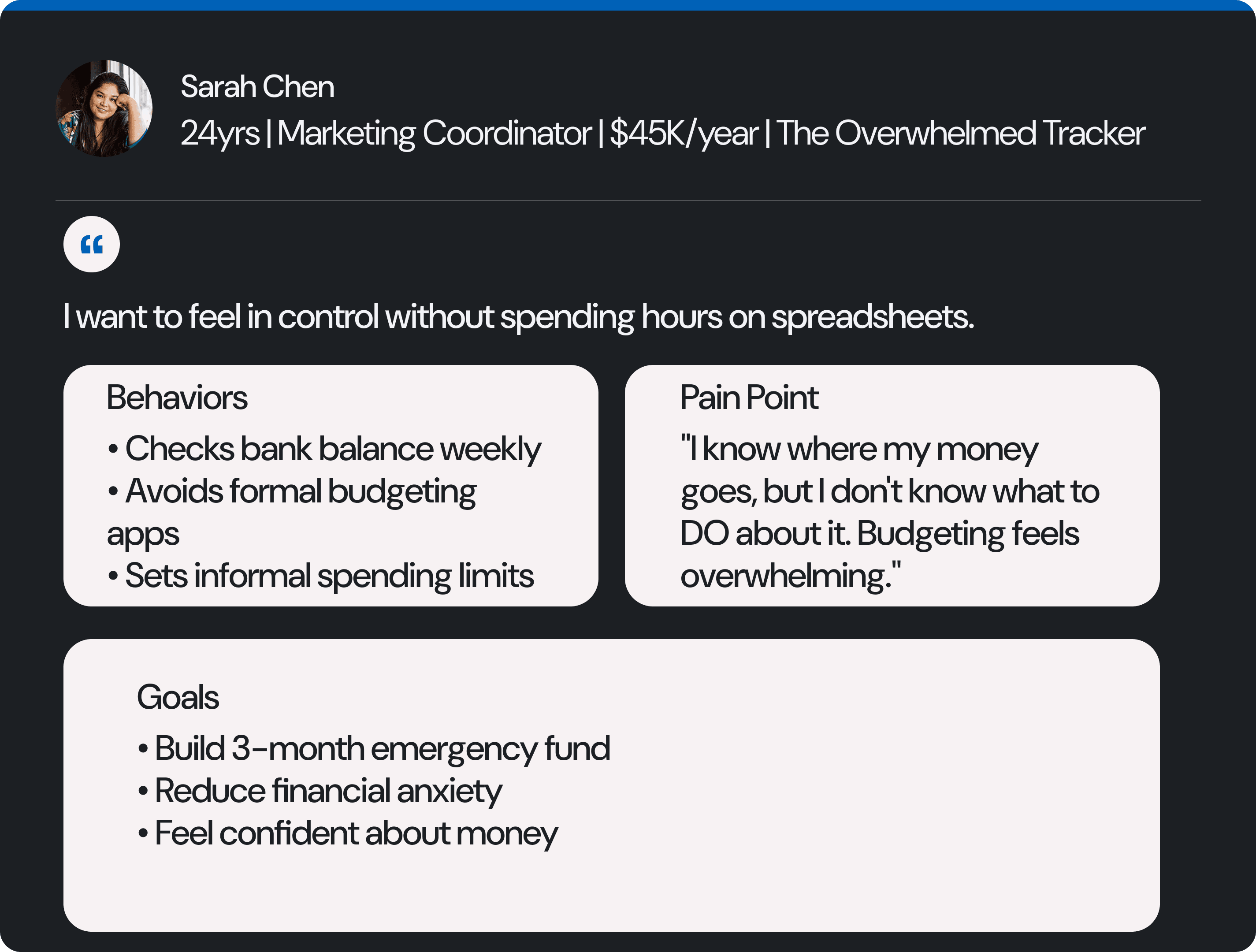
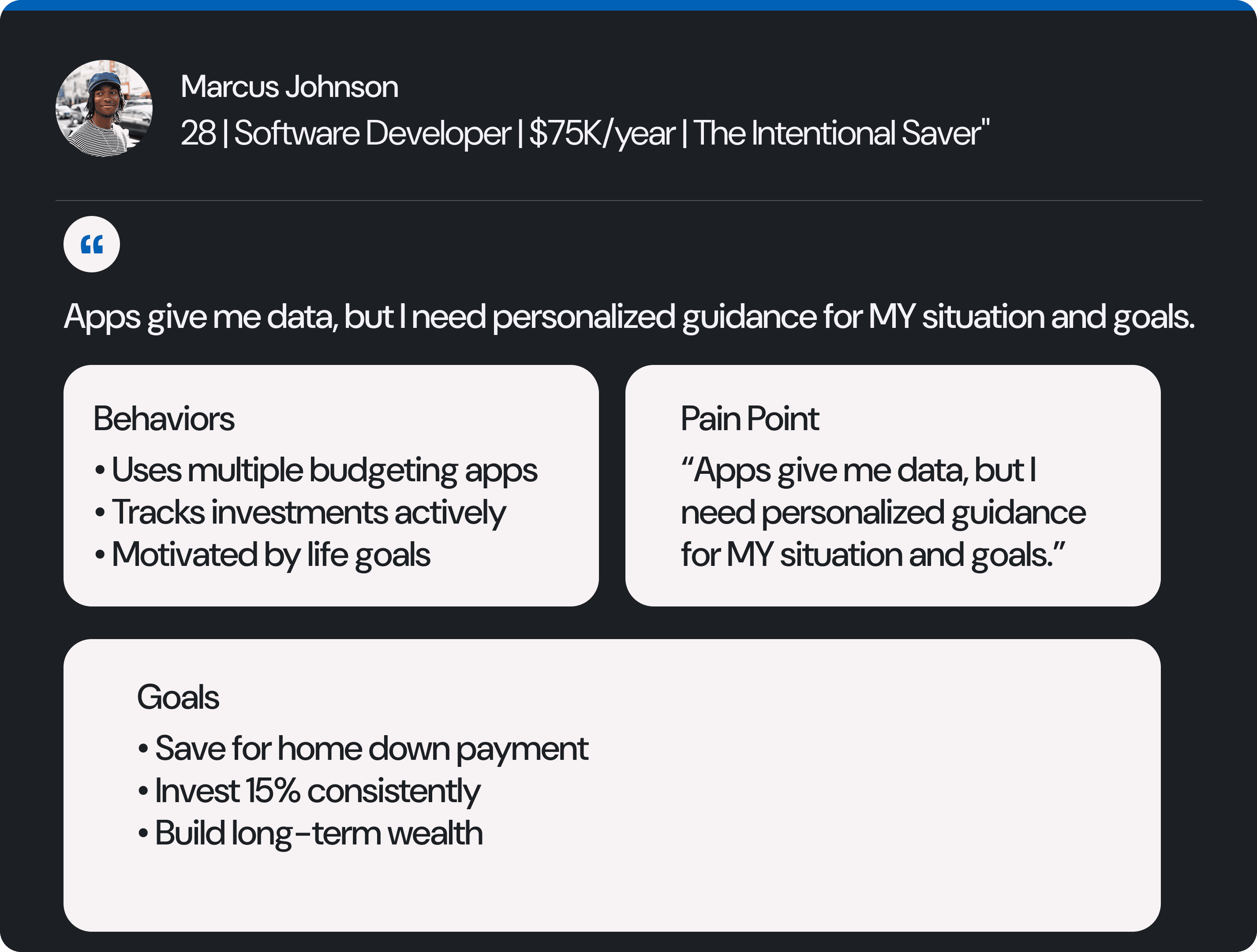
Interviews revealed the anxiety was the design problem
I conducted interviews with employed adults 18 to 34 who use mobile banking or budgeting tools, screening on frequency of use and where they feel least confident. From those conversations, I built two personas.
Sarah wants simplicity. Marcus wants depth. The gap between them became the design constraint.
The 40-second collapse
In today's tools, the line drops at pattern discovery and never comes back up. Everything that would help someone act never happens.
That collapse lasts about 40 seconds. You see the number, you feel bad, you close the app. I decided the entire product should live inside that gap. I mapped where people get stuck versus where they could be.

The strategy
Four steps: notice, understand, decide, act
I set three principles and used them to kill ideas, not decorate slides:
Contextual insight - Explain the pattern instead of dumping every transaction to prove it.
Emotional intelligence - Reduce anxiety, don't add to it.
Actionable guidance - Every insight ends in a specific next step.
The flow is simple:
Notice the anomaly
A spending anomaly in a category.
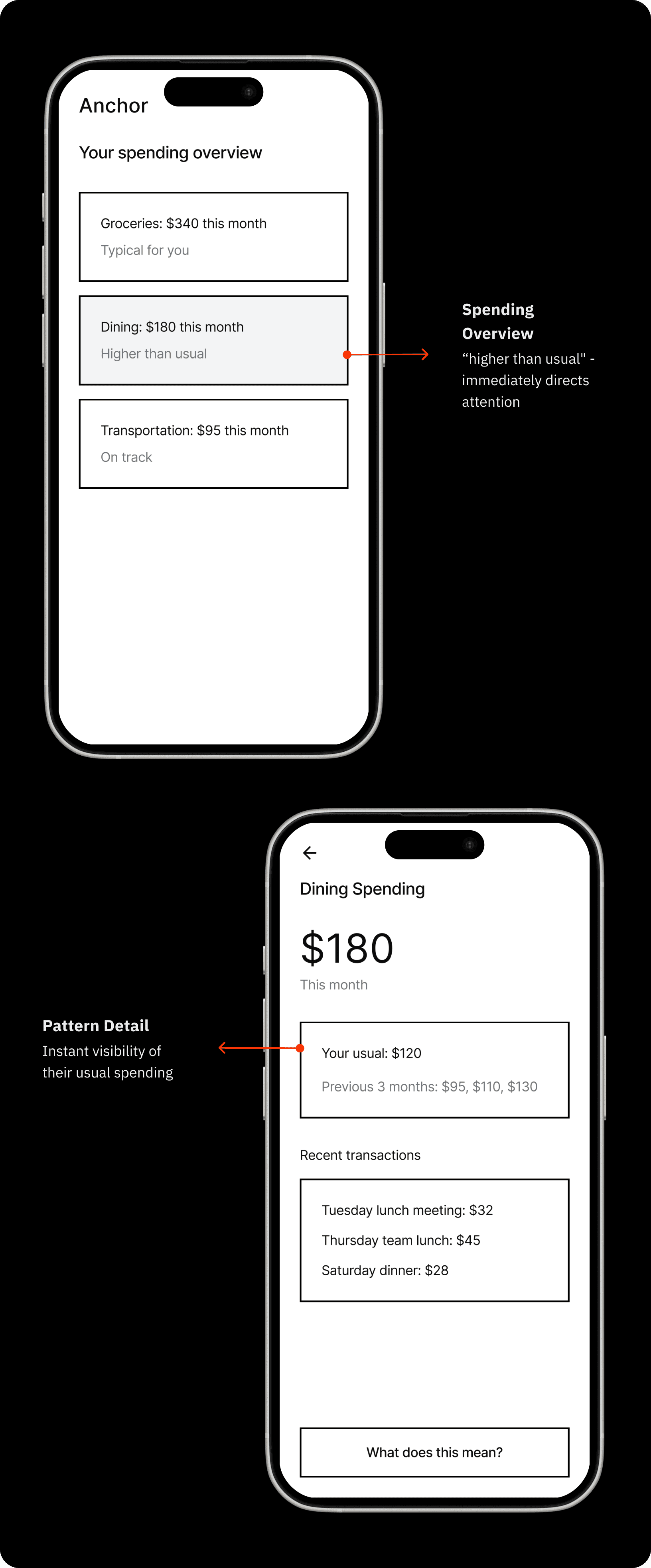
Understand the context
Understand why it matters.

Decide your action
Decide what to do with three real options.

Track the progress
Execute the choice and track progress.

Testing and iteration
Three users, one wall, everything changed
I ran three usability sessions: one moderated, two unmoderated. All three endorsed the core concept immediately. Then all three stalled at the same place.
Hurdle 1
The math nobody could verify
The screen showed "Your usual: $120" next to "Previous 3 months: $95, $110, $130." Nobody could figure out how those connected.

Hurdle 2
Partial evidence reads as hiding something
I showed three sample transactions totaling $105 against a stated $180 total. Every single person caught the gap.

HURDLE 3
What I left off screen was louder than what I put on it

Interactive prototype
Final Prototype
Click the highlighted areas to move through the four steps.
What's next?

If this shipped, I'd measure three things:
Does it stop people from abandoning? (Return rate)
Do people actually act on insights? (Conversion)
Do they stick with it? (Retention)
The roadmap prioritizes fixing trust before adding features. A feature sitting on top of an experience people don't believe is a feature nobody opens.
Retrospective
Three people isn't a lot, and I won't pretend it is. What makes it worth something is that they all failed the same way independently. That tells you something even at n=3. What it can't tell me is how common this is or whether people stick with it over months. That's the study I'd run next with a real sample.
The strongest insight in this project came from my design being wrong. I assumed people would accept an analysis without seeing the data behind it, and that assumption was holding up the entire design. Finding out at the wireframe stage cost me a week. Finding out after a build would have cost a lot more.
The strategy held up fine. The execution didn't. Figuring out which one is which, and then hammering on the execution while leaving the strategy alone, is probably the real thing I learned here.